A User Experience Helping Women to be Active
An app and responsive website that aims to break down barriers that many women face when trying to be physically active.
What
An app and responsive website designed with the barriers to physical activity in mind
Where
London, United Kingdom
When
September to December 2022
Role
Ideation and user research
Wireframing
User testing
Prototyping with Figma
The Activity App and Website
It is well-known that we need to be physically active for both our mental and physical health and 13 million women say they would like to participate more in sports and physical activity (Sport England). Unfortunately, there are many barriers stopping women from being physically active. Something I want to help to change with this user experience.
I designed the user experience, from empathising with the user to testing high-fidelity prototypes. I learned plenty throughout the design process which I have referenced in the following case study.
01
Competitor Audit
My research goal was to identify barriers that prevent women from being physically active and design an experience to help inactive women feel more confident partaking in physical activity.
I kicked off with some primary research, focusing my time on reports from leading organisations in the sporting world, such as Sport England. This gave me a better understanding of why women may be physically inactive and helped guide my upcoming interviews with potential users.
Continuing my primary research I completed a competitor audit to better understand how organisations help women be more active. I audited three fitness apps and websites; Class Pass, MoveGB and Adidas Training. I chose these to understand what leading fitness organisations do to help women be physically active. I also included a habit-building app as my literature review highlighted that building and maintaining habits was the struggle many women faced when being physically active.
Class Pass
Positives
Clear filter options
Clean, clear, clinical design
Easy booking process
Negatives
Home screen overwhelming
No help with routine
Map view - location markers too big
MoveGB
Positives
Clear explanations of activities
Easy to see what is on offer
Clear listings
Negatives
Cheap looking imagery
Text too small
Location and search didn't work
Strides
Positives
Fun with emojis
Goal tracker - bar chart, percentage and pie chart
Negatives
Cheap and cluttered
Small, low-contrast typography
Difficult to understand features
Adidas Training
Positives
Workout plans
Subtle branding
Explanation of workouts
Negatives
Navigation options not clear
Not sure how to favourite workouts
02
User Research
Following my primary research, I wanted to dig deeper into the barriers stopping women from being active and answer the following questions:
What motivates people to be physically active?
What are the barriers to starting physical activity?
What are the reasons for stopping the habit of physical activity?
My primary research highlighted that participants of past research often cite lack of time and/or money as reasons for lack of activity. Though this may be what they perceive as true, the research showed that there were often underlying courses to these symptoms. Knowing I wanted to dig deep into participants’ answers and that the topic was potentially sensitive to the interviewees, I moved forward with 1-1, remote interviews.
The explorative research was limited to attitudinal research due to restraints on time and budget. This meant that the research was reliant on the self-reporting of participants. If I had more resources I would’ve completed behavioural research to cross-reference the attitudinal research.
Before starting my research, I assumed the barriers stopping women from being more active were based on a dislike for the activities themselves. As my research progressed, I realised the barriers were wider-reaching, including facilities, family pressures and how difficult it is to build a new habit. This understanding helped guide my designs moving forward.
Using the findings from my research so far, I built empathy maps to help me highlight the users’ pain points.
Pain Point One
Fears the class is not at the right level
Users want to be confident that the class won’t be too difficult as they feel silly if they have less experience than the rest of the class. They also don’t want the class to be too easy as they see this as a waste of time.
Pain Point Two
Hates reviewing websites and apps
When searching for activities such as exercise classes, users find it frustrating having to look through different websites and apps as they are all different and the information they are looking for is in different places.
Pain Point Four
Easily slips out of the habit
With all the will in the world, life gets in the way of physical activity for the users. They need flexibility and the ability to easily book and reschedule activities.
Pain Point Three
Facilities and staff must be welcoming
When attending exercise classes at gyms or studios users want to feel they are welcomed by staff. The facilities must also meet a certain standard, including good hair dryers and quality soap.
“I don’t want to be that person how doesn’t know the poses...it’s embarrassing”
03
Personas
Guided by my research I built personas to help frame the users of the app and website.
Through personas, problem statements and user journeys, I started to build a profile of the user and how I could make it easier for them to be more active.
Problem Statement
Rebecca is a busy professional who wants to be able to book a convenient activity via an app. She knows she should be more active but finds it difficult to keep a routine.
Problem Statement
Sarah is a new mum, who just returned to work and needs a website to find, compare and book activities because she has fallen out of the habit of being active and wants to double up an activity to meet with friends.
04
Wireframes
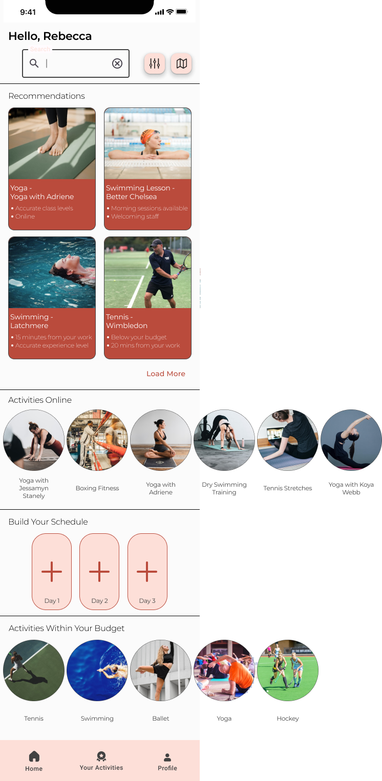
Now that I had a good understanding of what barriers users faced and what motivated the users, I started to design wireframes. Users get disheartened when they see lots of options but few appeal, so the experience needed to be personalised and simple. The flexibility of the experience is also important so in-person or online options needed to be prominent.
Using the progressive enhancement theory, I started drafting paper wireframes for the app. I did this so I could focus on the key features and build out features for the bigger screens later in the design process if required. I then transferred the design to a digital format using Figma.
App Home Screen
05
Prototypes
Throughout my design, I wanted to make the UI appealing to women who are not used to looking at fitness apps and may be put off by overly sporty imagery and language. Where possible I used photos of women from diverse backgrounds who are smiling and aren’t overly sporty. I did this so the user can see themselves represented. I chose calming pastel colours to be as far away from the loud, in-your-face fitness branding that is prevalent in the fitness market.
I carried out several rounds of moderated usability tests with the goal to check how easy it was for users to find and book appealing activities. The results of the studies helped guide each iteration of the design. As shown below, subtle changes were made to help users find more useful functions and improve the user flow.
Onboarding
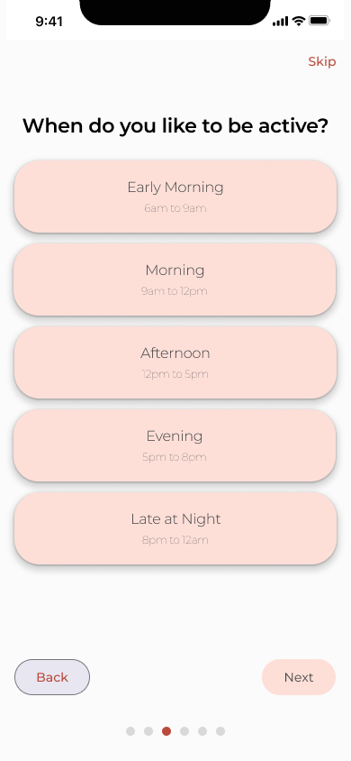
It’s very important that users complete the onboarding as it helps personalise the activity recommendations, therefore I designed the onboarding to be quick and as fun as possible. I included multiple-choice questions so the user didn’t have to think about their choices much. To make the experience more fun, I included sliders and dials which the users interacted with to answer the questions. Throughout the onboarding the user has the option to skip, giving them the power to complete the onboarding another time.
I initially put the ‘I don’t know’ button at the top of the choices to highlight that it’s ok to be uncertain. This had the opposite effect as 4 of 4 participants of a usability study were confused with the ‘I don’t know’ button at the top of the choices. I subsequently moved it to the bottom of the choices which stopped the confusion in future usability studies.
Homescreen
My aim for the home screen was to make the user feel welcome and in control. I achieved this by greeting the user by name as well as using a diverse set of imagery that highlighted women being active. I kept the user in control by showing a small selection of personalised recommendations before the fold and gave the user a search option if they couldn’t find what they are looking for. Another feature on the home screen is the ability to build a schedule of activities to help the user build a habit of physical activity.
I removed the motivational pop-up from the home screen as 3 of 4 participants of a usability study found the motivational pop-ups invasive. The copy of the motivational messages was well-received so I integrated the messages into the design.
Process
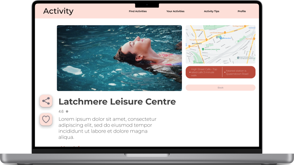
Throughout the process I wanted the user to be confident that they are making an informed decision and that they are in control of the process. I did this by including clear and simple explanations of the activities. The hierarchy of information is led by my research. For instance, it’s important for the primary website user to include socialising as part of their activity. The map and local tips are always visible on the right of the screen so the user can easily refer to the local amenities, including local cafes.
The process of booking an activity needed to be clear and simple but 3 of 4 participants in a usability study weren’t clear about what they were paying for. According to the Peak-End rule, this confusion could taint the user's view of the whole process so I made it a priority to redesign the payment screen to include more detail about what is being bought.
06
Accessibility Considerations
Sufficient Colour Contrast
The colour contrast across all designs meets the AA standard. This ensures those with visual impairment can have a good experience.
Use of alternative text fields
Alt text will be used to describe the design so assistive technology such as screen readers can function and benefit users with impaired vision.
Keyboard Navigation
Interactive elements will have a clear and logical order. This will allow for tab key navigation for users that can’t use a mouse.
07
Responsive Designs
After finishing the app designs, I moved onto designing the responsive website. My research showed that users that gravitate to the website would need more information to make a decision therefore I made the reviews stand out and included a new feature that allows users to attend taster sessions on the website.
08
Impact
The app and responsive website have both been well received by participants of usability tests. Users felt the designs made physical activity more accessible as the information was pertinent. Users also appreciated that the designs would bring the information they are looking for under one roof, making it easier to find a suitable activity.
The app and website will make it easier for women to find and book physical activities that appeal to them and assess whether the instructor and/or facility is appropraite for their needs.
“This [app] gives me the confidence to book an activity…the personalised information makes me feel special”
08
Next Steps
New Section
I would like to build out a ‘Your Activities’ section to meet the need for flexibility required for the user. The section will make it easy for the user to re-book, cancel and reschedule activities.
Activity Information
To help build the users’ confidence, I would like to include information about each activity. This would be a screen with key tips including basic rules, etiquette, and what to wear.
Track and Update Indicators
The personalised information is key to the success of the design. If the barriers to physical activity change, the design needs to change with them. These indicators will be tracked and updated if necessary.
What I Learnt
This project was a big learning curve. I learnt how important it is to complete initial research. Both the primary and secondary research gave a strong foundation to complete the project. This project also highlighted how important it is to understand what features are required for each screen as the user may have different needs depending on how they interact with the product.
I have since learnt that lengthy onboarding at the start of the user’s journey can put them off from using the product. Moving forward I would test whether a staggered onboarding would appeal to users more.
Throughout the certificate, I have found building a colour pallet challenging. I find myself throwing too much colour into my designs, making them loud and overwhelming. After reading about the subject and reviewing designs on Behance and Dribble, I improved my use of colour though it’s something I want to continue learning more about.


